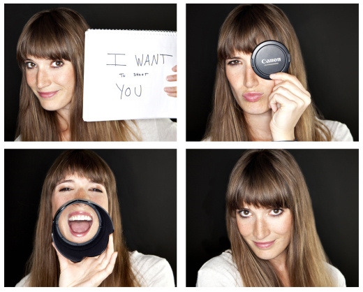
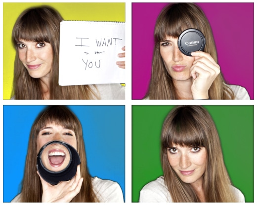
Many of you already know me on a personal basis, but for those who don’t, my husband Sam is an internet guru. I really don’t know how else to describe him. He works in hospitality helping hotels make the most of their online presence. This week he will be speaking at a conference in Tennessee and so he came to me because he needed a new headshot. Okay, so why is this interesting? Photographer takes picture of her husband… big deal. Actually it was what he taught me that was so cool I wanted to share it with everyone. On one of the blogs he follows Cyrus Shepard created a post called “How Optimizing My Ugly Google+ Pic Increased Free Traffic”. To sum it up, by placing a color behind the subject people were statistically more likely to click on that person or their link/article. Google likes to put our bio pictures all over everything it can now, and the internet has become overrun with black and white head shots, or head shots against a black, white, or grey background. So when I photographed him we did it against, you guessed it, grey (and I included a black and white of the shot for him too, aren’t I nice!?). He shared the article with me after our photo shoot.


He took it upon himself to add orange to the background (this is what we would call an artists rendering of what he did, I can’t find the actual file anywhere now)…

Orange. Bright orange. Now, no offense to my beloved or anything here, but after some convincing he let me have a go at changing the grey background to a color for him. I went with a techie blue (he also has blue eyes so that was inspiring me).

When I saw his new headshot with this color pop up in my text messages I the post hit home. My eyes immediately rush to his shot over all the other photos next to text messages in my phone (everyone has a little photo next to their message on my phone). The effectiveness of this in a larger setting (aka, the web) was not lost on me.
Since then, I’ve shot two more portraits one for a writer, one for a jewelry designer, both asked for blue as the color behind them.


At this point, I’m feeling rather out dated with my black background behind me in my bio pictures. Guess it’s time to update myself! What do you think??? Out with the old….

In with the Warhol?
