E-commerce Photographer South Florida | The Picture Sells the Product

Sometimes it’s hard to justify the cost of e-commerce photography, especially when the product will be photographed on a model. Instead of just paying for the photography, the client will need a whole team to produce photography that will sell products. That means (in some cases): photographer, model, hair & makeup (not always one person for both), stylist, assistants, location, catering (if the shoot is going to be a full day), etc., etc., etc. It’s hard to imagine getting all that on the budget that most startups have. So, how can you make the photo shoot worth it? Considering that a startup has a smaller budget, the goal would be to shoot less product perfectly, rather than shooting all of your product in a mediocre fashion. Think quality, not quantity. It certainly isn’t worth wasting the budget on sub-par shots. In the world of e-commerce photography, if you can’t do it right, don’t do it.

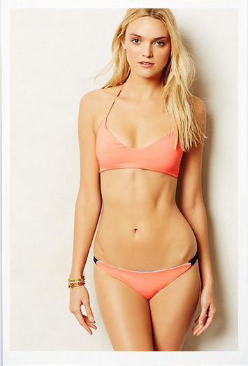
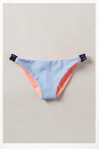
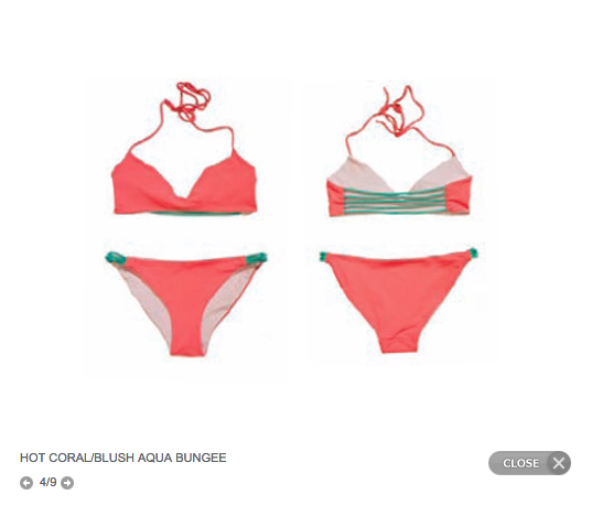
Recently, I came across a photograph of a swimsuit I liked. The still life shot looked really good and it was selling to me.

So I decided to follow the link to the website where I could buy it. Once there, I saw more shots of the swimsuit, including some that were on model and I really, really liked the swimsuit!

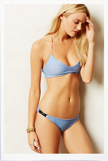
But, unfortunately, it was sold out. Lucky for me the company had put the designer’s name on the swimsuit so I did a quick search to see if I could buy the swimsuit directly from the designer’s website. And that, my readers, is when I did a double-take. I could not believe it was the same swimsuit. The designer had different colors but I had NO desire to buy this product in any color. It looked terrible in the still life; all the various colored swimsuits were shot differently. On model it was unflattering as well.

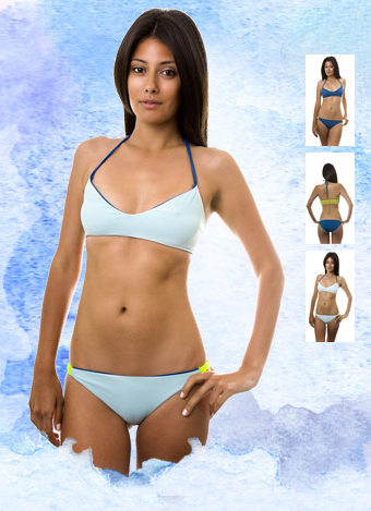
As you can imagine based on these photos, I’m not sold for a lot of reasons. Let’s look at this on model first. The suit isn’t showing me the side details at all, her pose is awkward and not relaxed which makes me wonder if that is because the swimsuit isn’t comfortable. This isn’t clear to me that the swimsuit is reversible here. I can’t figure out why I’m not seeing the back of the light blue swimsuit (it takes me a while to figure out that the dark blue is the outside of the light blue swimsuit and that is what I’m seeing).

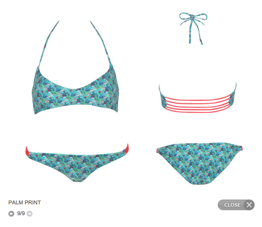
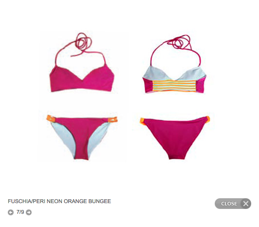
The still life images vary quite a bit. One shot makes the bottom look uncomfortably small. The straps are all different on the tops and it just looks messy. The description on the image tells us the color of one side and the bungee but not the reversible side which makes me wonder if they are all reversible , especially for those whose color is closer to skin color. Or, in the case of the palm print suit, I have no idea if it is even reversible.

I can only imagene the return on investment (ROI) for the first images was astronomically higher than the ROI of the second set of images. I’m sure the budget for the first set of images was also much higher. So to be fair, this is a “you-get-what-you-can-pay-for” situation.

Now, here’s what I would have done. If the client didn’t have the budget for great shots in all colors, I would have recommended that we shoot one swimsuit perfectly, then shoot color swatches of the details for each alternative colored swimsuit. If the budget allowed for it, I would say shoot that swimsuit on a model because the ROI will be bigger. If the budget didn’t allow for it then shoot one perfect still life and, if possible, one group shot with each swimsuit stacked showing the detail of each swimsuit displaying the bungee, the color inside and the color outside.

This would save time (and hence, money) by not having to style the whole swimsuit.

So there you have it. My two cents, from an e-commerce photographer’s perspective on what to do to optimize your e-commerce photography ROI.
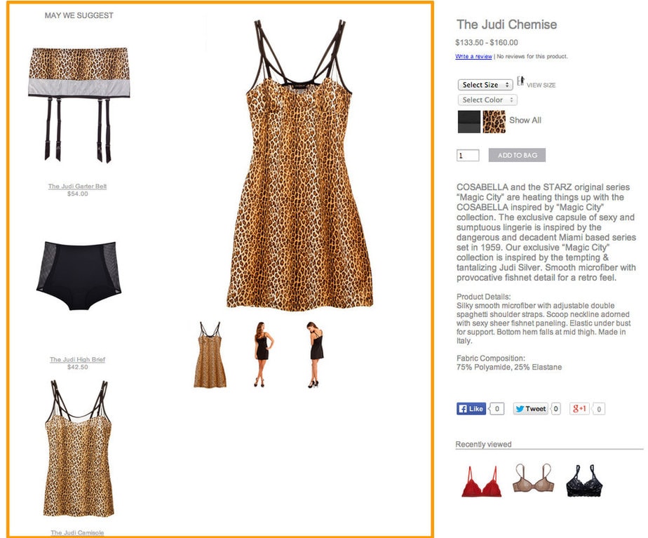
New E-commerce client

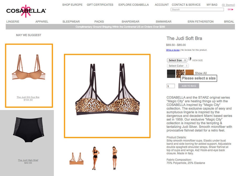
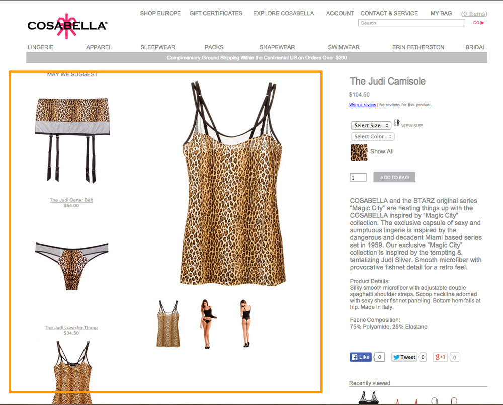
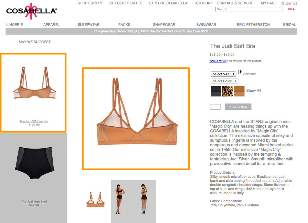
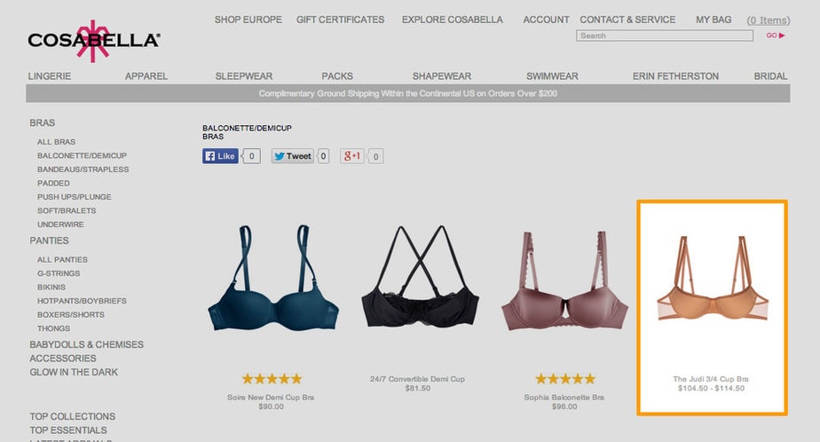
I’m so excited to add Cosabella to my client list! We’ve been shooting tests and perfecting the look for the website. Today I noticed the first pieces from our shoot went live! I have to say, I love being an e-commerce photographer. I know it’s not for everyone, but until you trouble shoot the styling and lighting of items like fine jewelry, sunglasses and bras (yes, I’m adding bra’s to the list of most complex items to shoot) you can’t know the rush of getting it right! Here are a few screen shots of my work on the site. Most of the corresponding pieces are also my shots! Enjoy and thanks Cosabella! I had a blast working with you and hope to do so again soon!

Testing E-commerce photos for new clients

One of the most valuable strategies for getting ready to shoot e-commerce with a new client is a test shoot. I almost always will recommend (or even sometimes insist) that a brand do a few hours of test shooting with me before we dive into their inventory and shoot all of it. The test shoot is my way to make sure I am giving the client the shots they need with the right consistency for their website. It is also how I double-check my per shot estimate to make sure that it is on track with the quote I gave. My e-commerce photography clients range in size from  less than 100 to 10,000+ shots a year (yes, I shoot a lot of inventory). The test shoot might be the most important shoot I do for those clients in our whole relationship. It is where I will lock in the lighting, styling, pre production preparation, retouching, and file delivery for everything we do moving forward. I usually ask to see some examples of what the client wants the final images to look like. After seeing those, we discuss the files they like and why. Then I get my hands on items to test shoot and we schedule the time. One of the nice things about my workflow is that the client doesn’t have to be present while I do the test shoot. I can run a screen share via Skype for example and I shoot tethered. So the client can be discussing with me each shot as they appear. This has been a  huge help because now art directors around the country can be hands on in the test without actually having to get on a plane.

It’s after the test shoot that I start in on the actual e-commerce photography for the website. Sometimes as fast as the next day or later that afternoon we can get the ball rolling for clients. In the e-commerce world, inventory that hasn’t been photographed is money lost so moving fast is critical. That test shoot lets me build realistic time estimates for clients so they know how fast the files can get back to them.

To the photographers reading this, whether you shoot portraits/weddings/anything it’s always a good idea to run a test shoot. Any big advertising gig’s I’ve ever had I dedicate a day in my studio with whatever team I need to work out the kinks of what we will be shooting. My husband has had to jump in front of my camera many, many times while I confirm lighting for a portrait to make sure the settings are where they need to be. A very good goal to have in photography is to make sure the time with the client/on the clock is used as efficiently as possible so test what you will be doing!


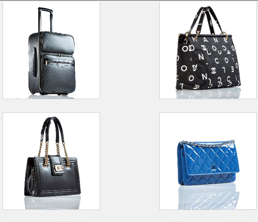
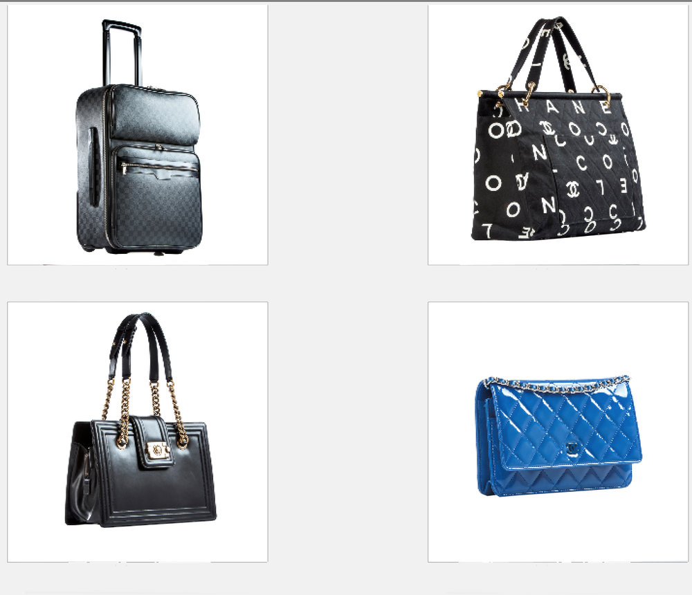
Example of testing lighting/angles for e-commerce on handbags:

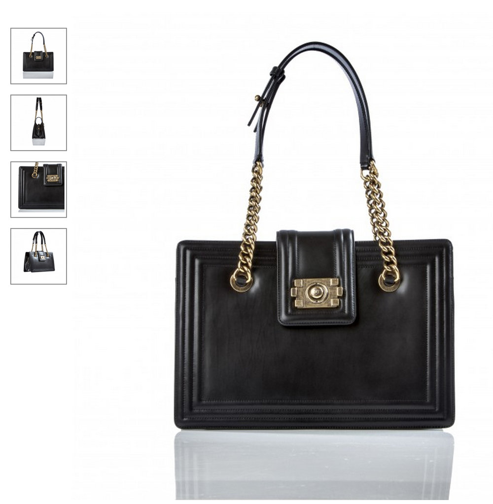
Then the same shot but without reflection so client could choose:

And finally, an example of how the client decided to use it:

Miami Product Photographer | Kate Benson Photography | E-commerce Photographer


Ecommerce photography, e-commerce photography, e commerce photography…. it is so new I’m not sure which would be the right way to say it, I see all three, often. When the buyer used to go to the store, pick up the bag, feel it, handle it, look at it on her/himself (equal oportunity shopper), they would know they loved it and make the purchase. E-commerce has changed all that. Having just gone through the holidays I can say first hand that I shop online. Why would anyone ever want to go to the mall or shops on a weekend in December and buy gifts when they can sit at the computer the instant the idea for the gift hits them and buy it right away? Or better yet, when you can go to Pinterest and see thousands and thousands of beautiful products/gift ideas and then buy them instantly? Like many who have found Pinterest I have become a devoted “pinner”. As a woman who likes beautiful things (follow my pins if you like, but I warn you, I am a bigger nerd than you imaged, by far…. and I use my married name, Kate Trotter) I am obsessed with Pinterest.
I hear you, you want me to get to the point. What do e-commerce and Pinterest have to do with each other? First an explaination in my own words of what Pinterest is, skip this part if you already know.

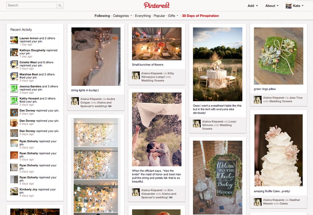
Pinterest works like this: you install a button on your browser which says “pin it” and anytime you stumble across any website with anything you want to remember you click that button. The button prompts you to choose a picture from the website to remember the site by, choose a “board” (a category you’ve created, ie. food, clothes, home, etc) and write a few words about it. Then instead of going through your bookmarks to try and find this cool thing you want to remember again, you go to your Pinterest page and see the picture with text and instantly know it is where you want to be. You can also “Follow” other people and when you sign into Pinterest it will show you what cool things the people you like are pinning, you can repin those links directly from there as well. Helping you find cool things in way less time. Here is a screen shot of what it looks like (it’s not all weddings, I promise, that is just what my friends are thinking about today):

Okay, so here is the connection. A while back I read an article in Fast Company magazine, one quote in particular stuck with me, “Across the web, the average sale resulting from a Pinterest user following an image back to its source and then buying the item is $180, according to research from e-commerce firm RichRelevance, compared with $80 for Facebook users and $70 for Twitter users.”  This doesn’t surprise me since I have Adblock installed on my browser and don’t see Facebook ads. Considering how much shopping I have done on Pinterest and how I have never clicked on a Facebook ad it makes sense.

But why we pin what we pin is almost 100% based on the picture. That image has to be perfect. We don’t fall in love with the product, we can’t see the product, we fall in love with the picture of the product and then we want that to represent our experiences with the product when we buy it. Being a small business owner it took me a long time to learn this lesson, I learned it through my website actually in the end, brace yourselves, the lesson is, YOU CAN’T DO IT ALL YOURSELF, YOU CAN TRY, BUT IT WON’T BE WORTH IT! To save money, we who are building our businesses want to do everything. But it ends up costing us more than we think. For the first few years of my business I had a custom website that either I built or my friends built for me. Updating it was a huge pain because I didn’t want to bother my friends and if I did it I screwed things up and spent forever fixing them. Finally one year I said enough. I found a template I loved, with an easy to use back-end for uploading images and text and forked over what seemed like crazy money at the time. Within the first month of the website up I sold a print (if you’ve been to my main site Kate Benson Photography, you’ll see it isn’t exactly fine art focused) that paid for the start up fees and first year of service. In my mind when I justified the purchase I thought, “Kate, if you book one extra job this year you’ll pay for it”. I had no idea it would be so quick to work. E-commerce photography is notorious for being done by owners of their small businesses, not professionals. With earning potential like you get on Pinterest, it is more important now than ever to do those photographs justice. You could have the most beautiful product in the world but if you don’t take the right picture you won’t sell it online. I sometimes get a little preachy to new business clients or potential clients about this, when the profit of the product is less than the cost of the photos it should be an easy decision to take great shots of it. Because if that photo helps you sell 10x the product you would sell if you did your own photo then you’ve made a good call.

But it is equally important to make sure that your website can be “pinned”. Speaking from experience on this one, mine cannot and it drives me crazy. If my website company wasn’t so awesome I think I would have switched a long time ago because of this. But they really have the best customer service I’ve ever experienced, (so no worries guys, I’m sticking around till you get rid of me) and I can be pinned from my blog so I’m complacent for now. But just like Facebook when it went publicly traded, Pinterest too could easily loose its luster. But not yet.

A couple other pieces of food for thought, Pinterest is the 3rd largest social networking site (behind Facebook and Twitter), is 90% female users, and commands (as we pointed out before) over double the average sale of any other site like it. Let me know if you need an invite to join as I’m always happy to send some out, but I warn you, it is addicting.

Happy holidays

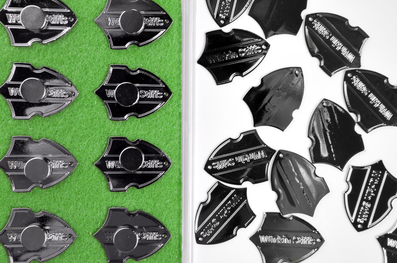
December has been an insane month. Like many of my months this year, it’s one of the things I am grateful for looking back at 2011. Many new clients popped up this year and many old clients took big steps in photography. I am happy to have been able to be a part of such transitions for companies big and small. From high fashion marketing photography for Donald J. Pliner to creative minds needing more straight forward product photography like those at Wurkin Stiffs the products I get to photograph always impressed me this year. I wish I had stumbled upon some of them sooner but it is likely next year many of the men and woman in my life will get gifts from these guys.
This week has started out as crazy as last was. I like to think that as the holidays wind down time opens up and I can stop and reflect in more blog posts and such. It seems that won’t be the case. So many a wallpaper Wednesday passed by unchanged, and many a friend, family and client left in the dark, it is with reflection and gratitude that my overdue blog post shares a little of what I’ve been up to. Here are some outtake shots of the Wurkin Stiffs shoot last week!


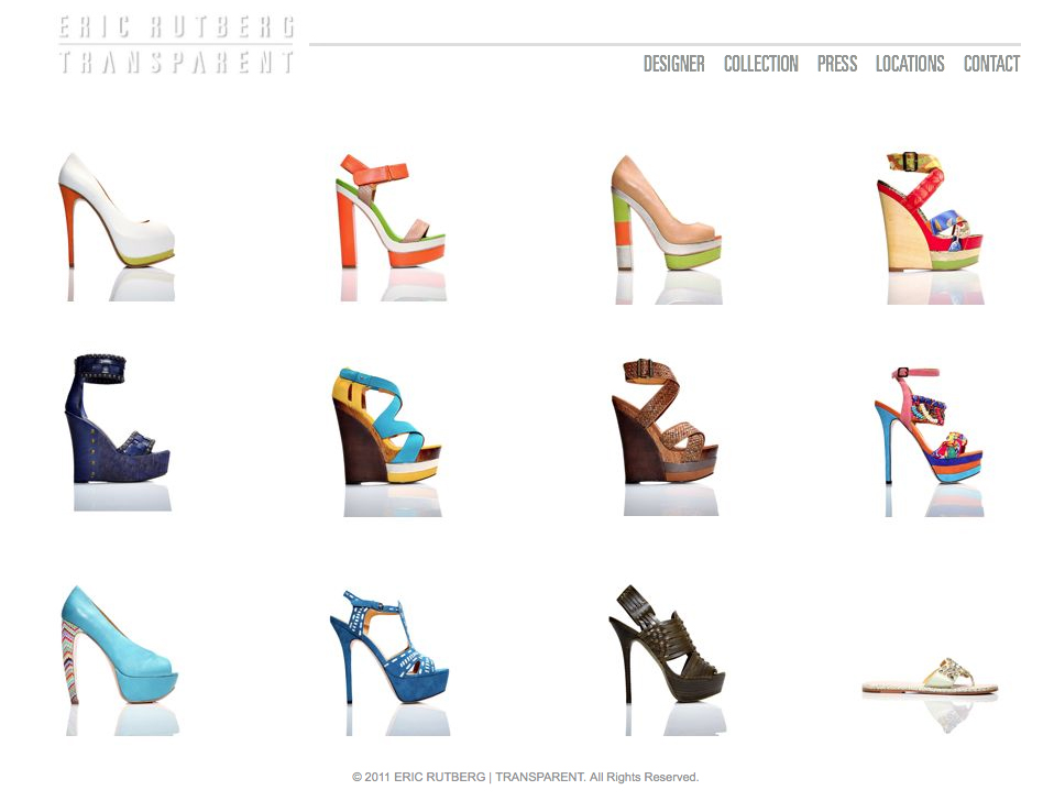
Eric Rutberg | Transparent

A few month back I shot Eric Rutbergs new shoe line Transparent for his website. Although it is still in beta I couldn’t resist sharing the preview I was sent. I love the way we decided to photograph his shoes. The layout looks beautiful and so are the designs on the product. Who says an ecommerce photographer’s job is boring? How could that be possible, just look at these shoes!

Subscribe To Our Newsletter

Join our mailing list to receive the latest news and updates from our team.

You have Successfully Subscribed!