Jewelry photography Tips: How to improve your website photography | Professional Jewelry Photographer Kate Benson
You have just taken the first step in elevating your jewelry photography. Hopefully you will find some of these jewelry photography tips helpful.
They were written to speak to a wide audience so feel free to skip around if you like!
With your jewelry photography, you may be doing it yourself, or working with a photographer and not getting what you want. To get started, here is is a video of what a lot of jewelry photography looks like (although not how all professionals do it) and some of you may watch this video and say, “I would be happy with jewelry photography like that!” while others have had photography like that and are looking to elevate it.
Regardless of your situation, there are ways to help improve your images. You’ve put a lot of time and energy into designing your pieces, and you want your jewelry photographs to reflect that! Here are 8 tips from a professional jewelry photographer to help elevate your photos.
Tip 1: Have Your Pieces Professionally Polished and Cleaned
Before you bring your jewelry pieces to a photoshoot, make sure to get them professionally polished and cleaned. This will elevate your images because they will look almost new and flawless. When looking at a jewelry image, the camera is much closer to the piece than the naked eye would be. This means the image will show any scratches or flaws in the jewelry that otherwise would not be noticeable. Many of these blemishes a professional photographer can edit out in post production. However, keep in mind that your photograph cost is equal to how much time is spent on your products. If a photographer needs to spend a few hours retouching your images, then your per image rate will be more expensive than if you had your pieces cleaned and the photographer had few corrections to make.
Professional jewelers will be able to polish your jewelry and remove most scratches, too.
For example, when jewelry photographer Kate Benson worked with estate fine jewelry for Fine Art Auctions Miami, they would have their pieces professionally polished and cleaned before each shoot. These were mostly worn pieces from private collections. This helped to elevate their images as the product looked as good as it was going to before she photographed it. The images were requested to not be deeply retouched as the buyers needed to see the real state of the jewelry. So getting it well cleaned and polished was critical!
Tip 2: Don’t Wear Jewelry You Want Photographed Before a Photoshoot
Staying along the lines of getting your jewelry professionally polished and clean, is not to wear any jewelry you want photographed. It is tempting when you create a beautiful piece and have the chance to enjoy it yourself to put it on. However, wearing jewelry before the photoshoot exposes the pieces to risk that isn’t needed such as, scratching the pieces, fingerprints, dusts, etc. All of that will increase the likelihood of the pieces needing to be cleaned professionally or be subjected to more retouching.
If you are looking to clean your jewelry yourself, here is a video taking you step by step. Note: This process will not help to remove scratches.
Tip 3: Review and Carefully Select the Pieces You are Going to Shoot.
Manufacturing defects can happen. When picking out which pieces to photograph, check for everything. Some of the common issues that come through photography studios are:
- Crooked jump rings
- Loose stones that can fall out
- Scratches or dents
- Broken clasps
- Inconsistent assembly of pieces (for example, logo tags changing the sides of the pieces they are on).
By taking a close look at your jewelry and confirming the pieces are in the best shape possible you will save on retouching time. If you are working with a photographer, send more than one piece of the same jewelry to the shoot, so the photographer can pick out the best looking one.
Tip 4: Plan Art Direction for Each Image You Need Before Your Shoot
Whether you are building a website from scratch or creating an ad campaign, plan out every shot you need before shooting and make sure your pieces work for that shot. This is more important if you are working with a photographer but having things mapped out keeps each angle of each style piece consistent to how you want it to be. When putting images on a website you don’t want the angles of jewelry to shift. You want the website to look consistent and seamless. Having these guides will keep you from shifting what the images look like.
If you are working with a photographer, letting the jewelry photographer know what you want is crucial to getting the photographs you need. Map out with images (either through testing with your photographer or collection inspiration on you own) what images you like. The photographer will want a guide of how you want each shot she/he is taking to look (roughly). From there, jewelry photographers can have a place to start and offer suggestions of alternative options for lighting, angles, etc. where they see something might work better. Most photographers expect to have a conversation about this before the shoot. During that conversation, consider that a jewelry photographer has seen a lot of product like yours before and has an idea already of why some pictures work better than others. Take long chain necklaces for example. How far do you zoom out for your image to show such a large piece? Too far will not show the details of the necklace. A jewelry photographer might suggest either including a zoom feature on your website so customers can see those details clearly, or to add detail shots as secondary images of your piece.
Keep an eye out for future blog posts on how to create moodboards and shot lists for art direction.
Tip 5: Keep it Consistent
Regardless of if you are shooting yourself or a professional jewelry photographer is, use a tripod and make sure the jewelry isn’t shifting/moving around when it is photographed. For example, hanging necklaces might sway for a while, so either place something behind them or wait until they stop moving before shooting. Regardless of if you are using natural light or not, make notes about what the light values were. If you have studio lights, write down their values, positions, and modifiers. If you are shooting in natural light, record the time of day, the weather, etc. Light will change color when it is cloudy or sunny. You want to be able if you are shooting yourself to go back and recreate the setup you have next time you have new pieces to shoot.
If you have a professional jewelry photographer, confirm that he/she is taking steps to recreate your setup when you have more product ready to send. Product photographer Kate Benson had this to say on this topic, “Consistency is one of the reasons I don’t often select to shoot product in natural light. It can be a beautiful atheistic but after spending a decade working in South Florida where the weather changes constantly chasing the light values, temperatures, and adjusting modifiers to correct for clouds/sun slowed down work and created too many variables and hence, inconsistencies. I prefer to create natural light in studio now when clients want that look.” She explained that each client has their setups and lighting recorded through pictures and charts so whenever they send product again it will look like it was shot at the exact same time once it is on the website.
Tip 6: Matte vs. Shine
Jewelry is a finicky product to shoot. It acts like a mirror, reflecting everything. So what is reflecting in the metal is as important as what isn’t reflecting. Obviously you don’t want to see the yourself/the photographer and camera or objects from around a room in your jewelry but you may need to see something reflecting in the metal to make sure it looks right. If you have a matte finish on your jewelry you can get away with a lot more but when the jewelry has a shiny reflective finish then not seeing the right thing will look matte. Knowing how to put the right reflections into metal could make or break your sales + returns. If customers think they are buying a matte finish piece and get something shiny they could be very unhappy. So being accurate is very important. Pay close attention to what the jewelry looks like in your setup. You may need to add some reflections to make it look right!
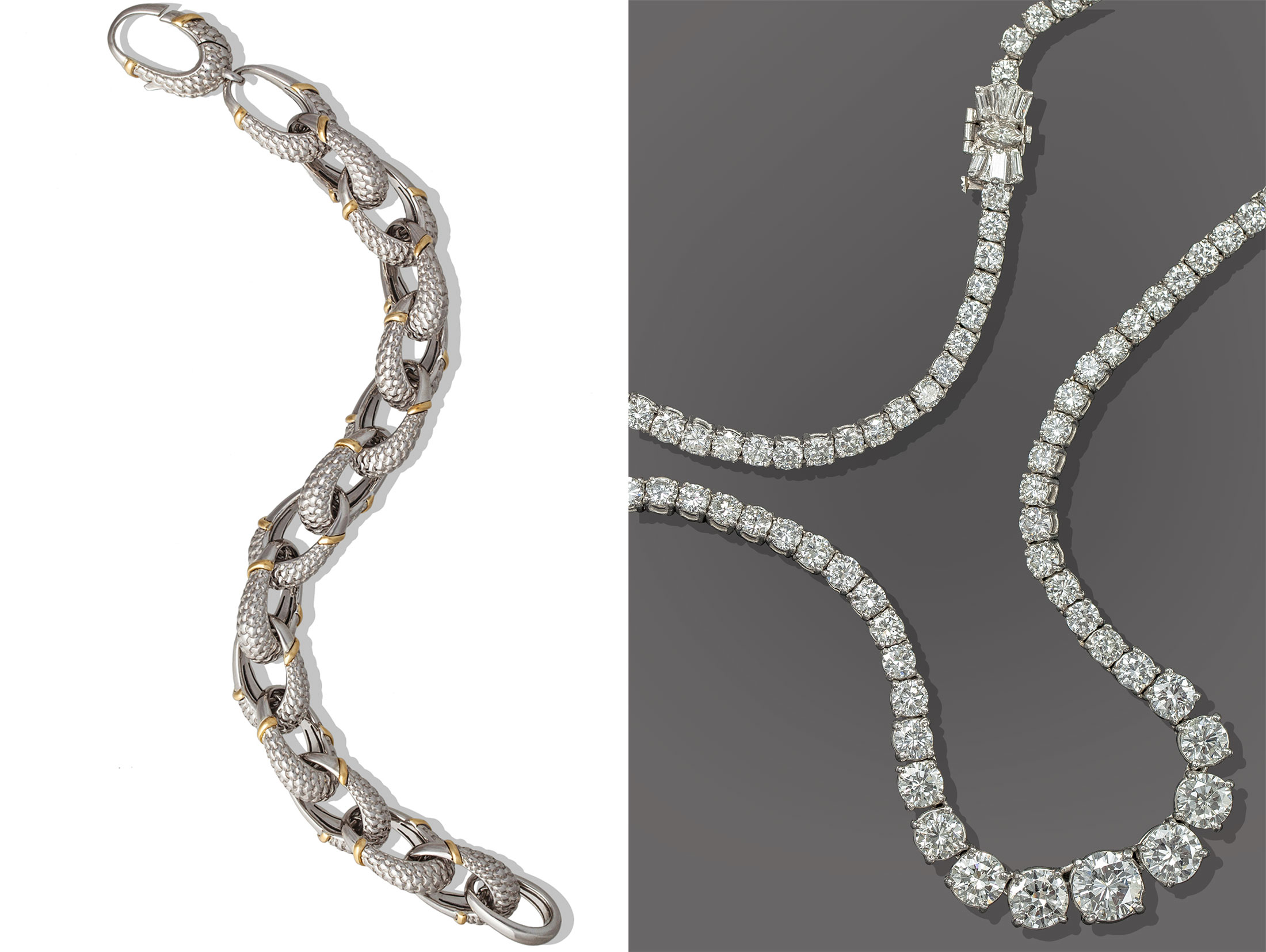
Let’s revisit the first video about taking photographs using a light tent. A light tent is a great way to minimize any reflections. Your jewelry will be surrounded by plain white fabric on all sides, with the exception of a camera hole. The only reflection you’ll have is from your camera. It sounds counterintuitive, but the problem with a light tent is that you have no reflections. This gives jewelry a matte look, instead of the shine that looks great and gives pieces shape. Jewelry photographer Kate Benson has been shooting jewelry for over a decade, and she uses a variety of papers, scrims, modifiers, and lights (and almost never a light tent) to make the setup completely adjustable for each piece as necessary. “I have better control over the reflections in each jewelry piece this way. If I’m shooting rings that are different sizes, I can make small tweaks in the lighting setup to make each piece look its best. If I just put one on after the other, and didn’t make any adjustments, the reflections could look wrong.” Here’s an example of a piece of jewelry shot in a light box versus a controlled studio setup.
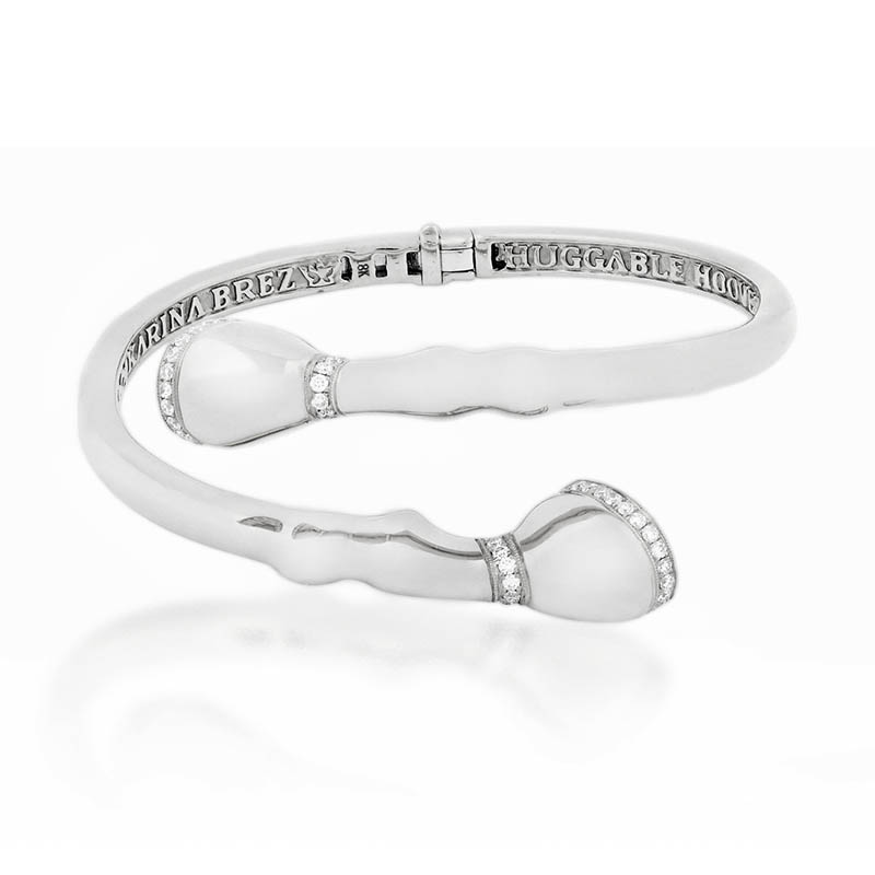
Bracelet shot using a light box by anonymous photographer
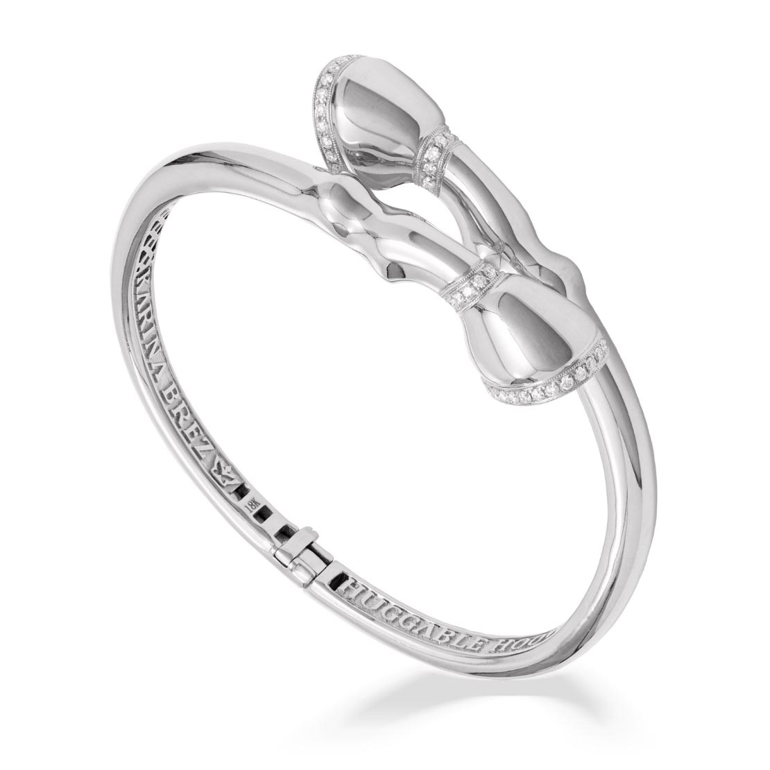
Bracelet shot in studio with a custom lighting setup by Kate Benson
Tip 7: Test it Out
There is a rumor that Vogue Magazine makes 5 different covers for every issue and then sends those covers out to a group of design talented beta viewers who will vote for the cover they like best. Regardless if that is true or not, that concept is a great way to elevate your jewelry photography. Whether you plan on using the photographs on your website, in mailers, or for banners and billboards, creating a few different mockup versions and seeing which ones look the best is sure to improve your photography usage. If you have a single piece, try seeing if your jewelry photographer offers a test shoot option where you can hire her/him to explore a few different photographic options to see what works the best.
Tip 8: When in Doubt, Hire a Professional Jewelry Photographer
This is probably the fastest way to improve your jewelry photography. Keep in mind, hiring a professional photographer is not the same thing as a professional jewelry photographer. True jewelry photographers will pay close attention to what your jewelry is, what it needs to look like, and will make sure it all translates beautifully in the photography. You can estimate the per shot rate from a professional jewelry photographer in the range of $30 – $80+, which is extremely dependent on what type of jewelry you have, and how many pieces. If you have a ring that you sell with different colored stones on it, it might be possible to recolor the stones, and you might be looking toward the $30 range. If you have fine jewelry that needs a specific lighting setup per piece, you are looking at the higher end of the spectrum. Jewelry photographer Kate Benson recently did a shoot for a client with a high volume of images needed for the brands website and Amazon and was able to get the photography for under $20 a shot with testing because the volume was so high.
Many professional jewelry photographers will not give you this per image rate, but instead quote you based on an hourly or day rate. This way, they have the time they need to get your pieces to look stunning. A lot of work goes into a jewelry photo, including initial prep (like extra polishing), styling (especially difficult with chains), test shooting (if you needed it ), shooting (and lighting adjustments as needed), then retouching. If you receive a per shot rate, confirm that you know the final photography you are getting includes all the elements you need. Make sure every part of the shoot is spelled out before they do the work for you. The last think you want is to hire someone to do a shoot for you and then realize you needed background cleanup, more retouching, clipping paths, custom file sizes, etc. If you hire an hourly rate photographer you can always go back and ask for these things and they can invoice for them after but if you have a per shot rate this might not be included. Over communicating to the photographer is better than under communicating! It takes time but is worth it to avoid any issues later!
In conclusion
There are many factors that can increase your chances of getting the best jewelry photography for your brand. Be confident in what you decide to do and remember that if you try one way and it doesn’t work, you can try something else. Leave any questions you have in the comments and Kate Benson will get back to you ASAP!
