Miami Product Photographer | Kate Benson| Christian Roth Eyewear Composites

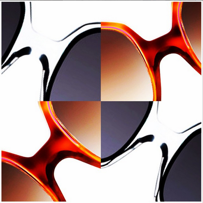
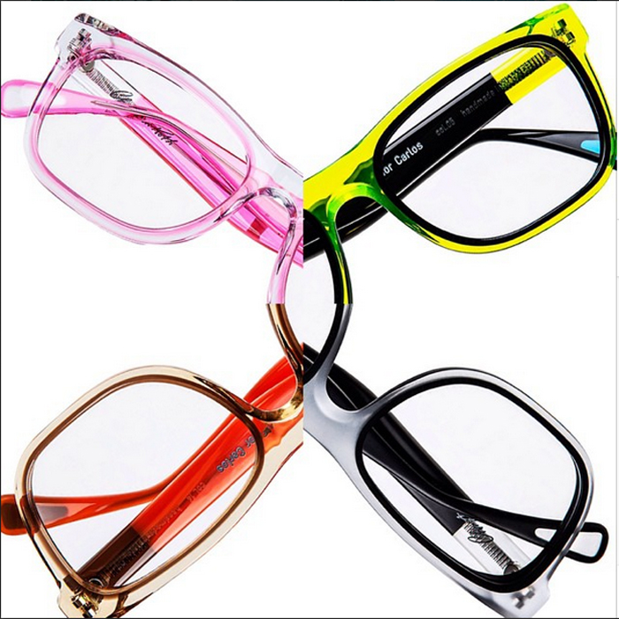
One of the best parts about shooting e-commerce photography is seeing how much more clients can do with the images I deliver! My client Christian Roth has fabulous eyewear! I’ve posted about it a few times because I really just love shooting it so much! A few weeks ago, Christian and Eric posted on their Instagram these incredibly creative composites. I had to grab a few screen shots of them and reshare. My personal favorite is the sunglasses set. If you think this is cool, you should see their website!

Naturally, I have a pair that I wear every. single. day.

Miami Product Photographer | Kate Benson | Cosabella and FX’s The Americans Team Up!

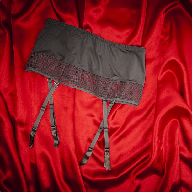
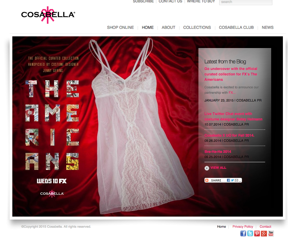
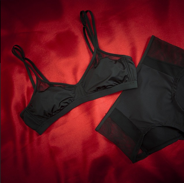
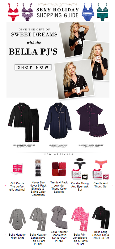
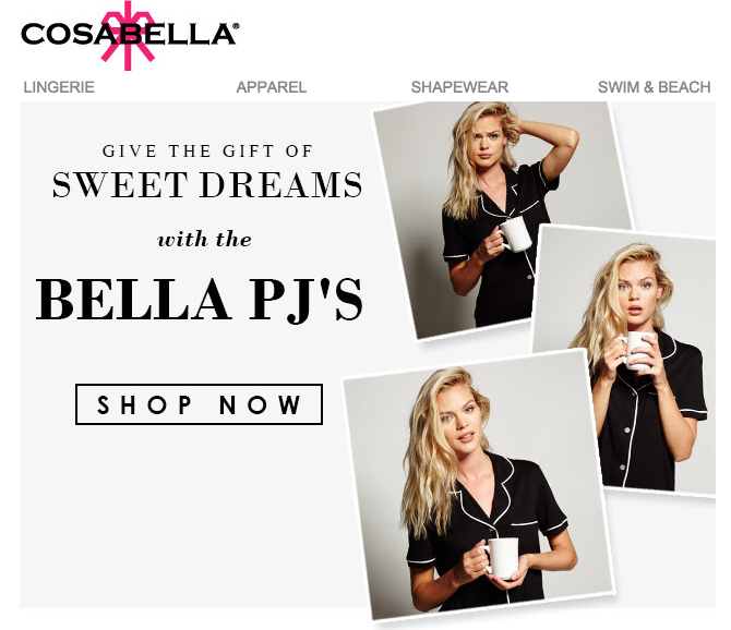
Recently, my client Cosabella has teamed up with FX to collaborate on a project for their show The Americans. In the cross promotion, they needed some sexy still life shots of a few of their signature pieces. The still life was designed out with FX to go along with window displays and other in store cross overs. It was a bit last minute when they called for the shots because everything needed to happen fast enough for FX to have time to do design work on the shots but we made it work! As always, I had a blast shooting for Cosabella! Here are a few of my shots in use on Cosabella’s website and email blast:

For a bit more info, check out InStyle’s blog post on “The Official Curated Collection for Fx’s The Americans

E-Commerce Photographer South Florida | Website Product Photographer

Last week, the on-model images that I shot for Cosabella’s Fall 2014 debuted on their website. This shoot is a great example of the synthesis of product photography in still life e-commerce and on-model photos. In this photo you can see both types of images.

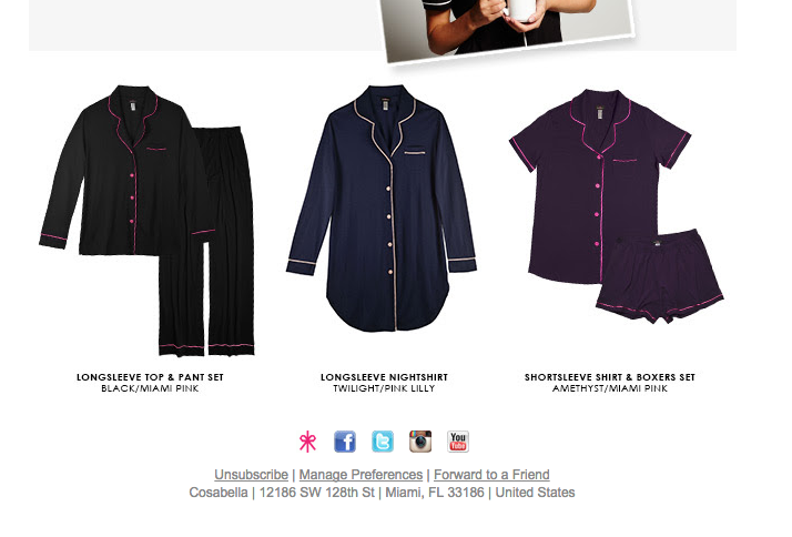
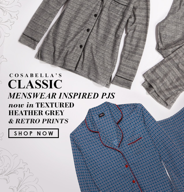
Pajamas are certainly not easy to shoot due to their “comfortable” nature. There is a lot of material to work with and the structure is often boxy, which doesn’t give much shape to the garment. Here you can see the difference between the still life photos of the pajamas and the on-model shots. The still life images show the important details of the garment and the on-model shots convey a lifestyle image to the consumer.

In addition, two of my still life shots were used in email blasts. For these particular still life images, you can see how there had to be some foresight as to the placement of graphic design or text which might be inserted into the frame, so I purposely left space in the photo to allow for this.

As you can see, by elevating the photography for your website, you’ve elevated your brand.

E-Commerce Photographer South Florida | Photography Studio South Florida

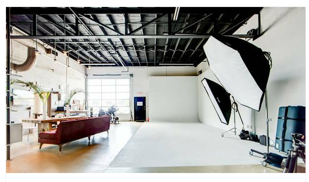
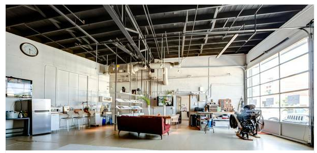
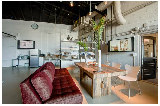
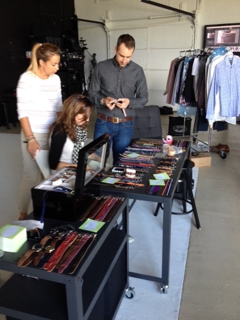
Last week I moved into a fabulous new studio space. Although my old studio is extremely functional, I was quickly outgrowing it and was quite happy to find this new, larger space. It is an industrial-style studio in Fort Lauderdale’s Art District so the neighborhood is fun and funky and the space has a “New York” feel to it.

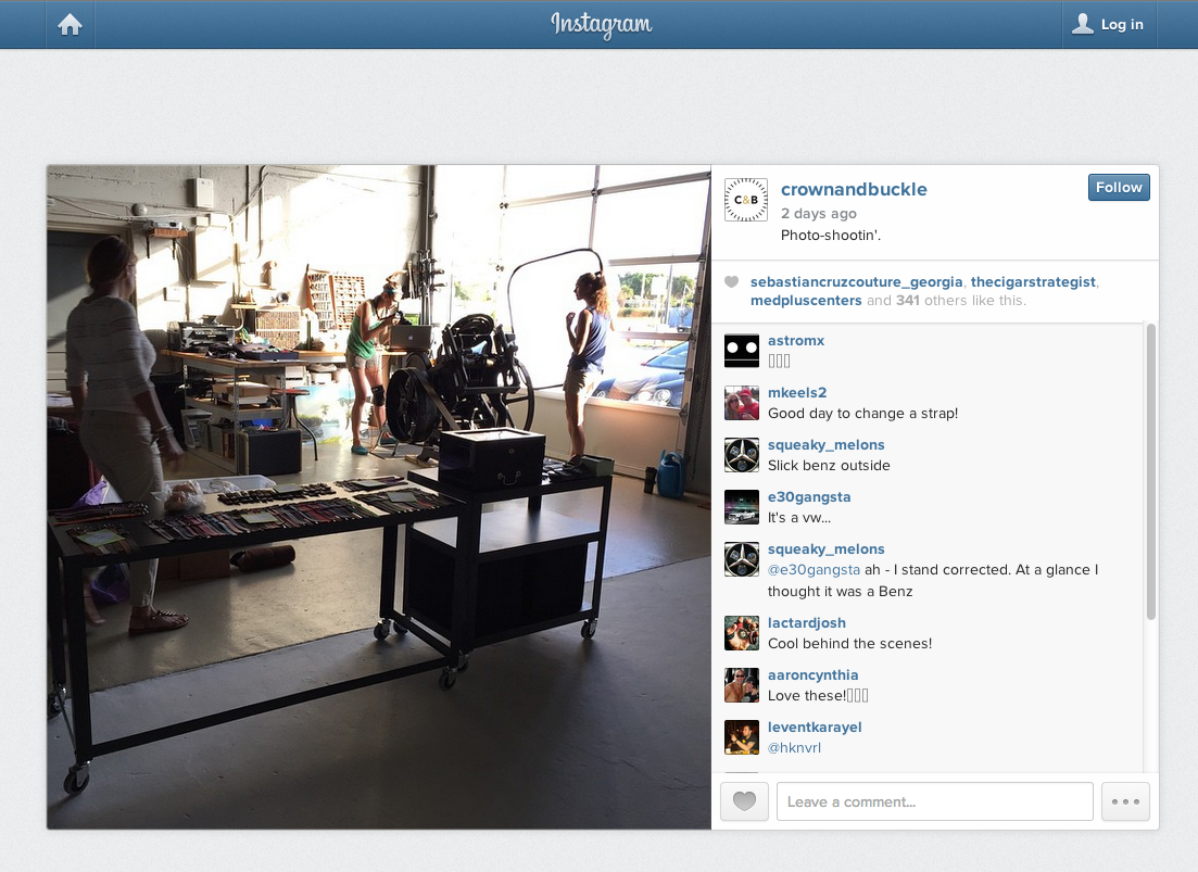
Our first shoot took place last Saturday and was quite successful. In fact, all the little details of the studio space helped contribute to the shoot. From the rustic wood tables to the vintage 1913 letterpress to the old fashioned tools decorating the place, all the charm of the studio ended up being perfect as additional features we used in the shoot.

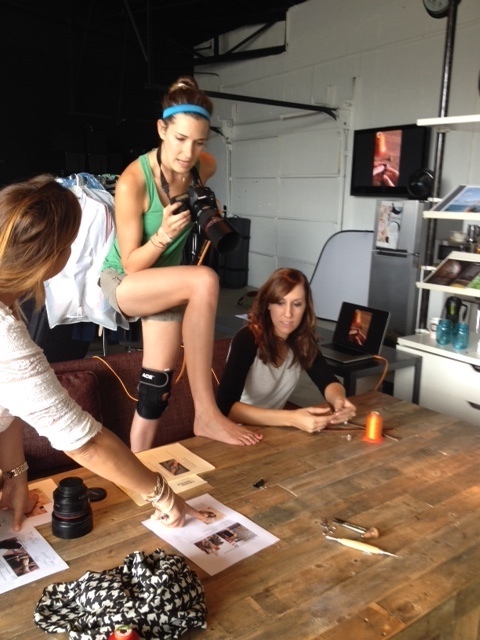
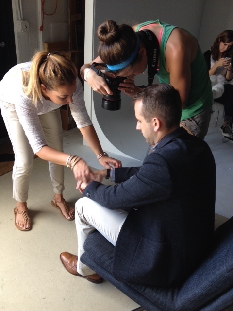
The client was Crown & Buckle, a watch band manufacturer with products made from gorgeous leather and nylon. We had an ambitious list with 35 shots on it which included on-model shots as well as still-life photos. Our mission was to shoot their online marketing imagery that would be used as intro shots, banner shots, e-commerce shots and product shots, as well as for social media and email blasts, so we had a variety of tasks for the day.

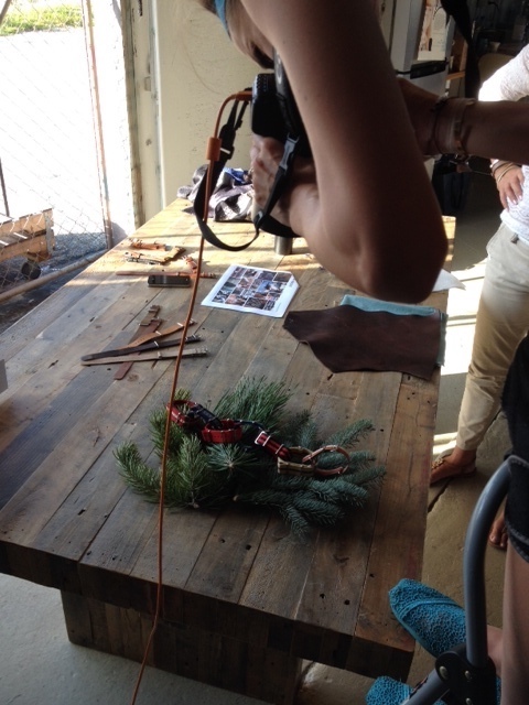
The studio has an east-facing glass door that brings in the most spectacular golden morning light. We took advantage of the light as much as possible, shooting the watch bands on the letterpress and the conference table, which were near the east wall. We also did some of the on-model shots there as well.

The owners of the company had brought quite a few props for us to use for the shoot. Old-style American flags, Christmas lights, their tools, a papier maché mounted deer head, a mounted deer head made of cardboard, scraps of leather, and they even had snippets of evergreen trees Fed Exed down from Wisconsin (because we don’t really have pine trees in South Florida). One of the best lines of the day came from Taffney as she opened the Fed Ex package and got a whiff of the contents. “It’s like Christmas in a box!” she exclaimed.

Motto is the branding agency based in South Carolina that had recommended me to the client. While they were not physically present at the shoot, we were able to send them batches of photos from the shoot for their instant feedback. The studio also had two flat screen televisions with Apple TV, so I was able to immediately show the client the shots I took on my camera from my computer.

All in all it was a great day at the new studio and we loved getting to know the people at Crown & Buckle and Motto.

For the moment, I am testing out the new studio space for a month to see if it is going to fit my needs, but so far so good. I will be sharing the space with The Guild 5 Forty Five members Gary James, photographer, and Kim Grijalva, creative director.

E-Commerce Photographer South Florida | My “Purse”-pective

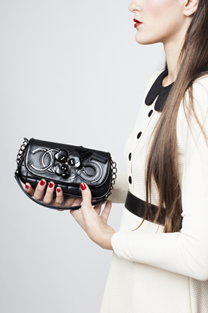
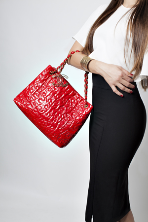
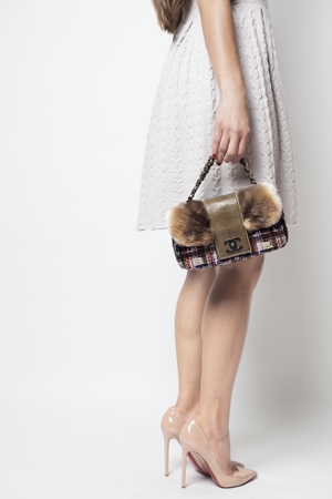
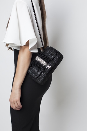
Back in September I spent some time shooting for one of my clients who purchases vintage Chanel handbags and resells them on her website. This is yet another type of e-commerce shoot. As you have seen with my previous blogs about e-commerce photos, the product is obviously the focus, and quite often the only object in the photo. With clothing, there is typically an on-model shot as well, where the clothing is still the focus of the shoot and the model is simply a live hanger for the garment. For this shoot, the client wanted on-model shots. The focus still needed to be the handbags, however, the models needed to be dressed. So, this involved some choices in clothing and styling that did not detract from the handbags. As you can see in the following photos, the garments chosen were in basic colors which complimented the purse, typically without large patterns or textures.  Blacks, reds, and whites all helped to serve as a live background for the handbags.

Another consideration is the framing of the photo. Again, it is imperative that the purse be the focal point of the photo. By using a model but not including her entire face, you are drawn to the item instead of the eyes of the model. The model is simply a prop for the handbag instead of the other way around. In each photo above, if the photo had included the model’s entire body, the purse would not have been in the center of the photo. Instead, it would have been in the bottom 1/4 of the photo (in the case of the plaid handbag), or the top 1/3 of the photo (in the case of the black handbag).

Clearly there are many different types of e-commerce shoots and countless things to consider when shooting e-commerce photos. A few main points to remember: keep your product in mind, maintain clarity in the image, and take into account the structure of the photo.

E-Commerce Photographer| Intro and Banner Shots

I recently shot marketing and lifestyle images for Frank Morgan’s American Swimwear, a startup company based in New York, whose brand focuses on the young, twenty-something crowd. As you can guess, a company’s website needs more than its e-commerce shots to sell the product. Having lifestyle photos which project the image that the company is targeting can really enhance the website. A strong intro shot draws customers to the site, where the e-commerce shots will then provide the necessary product information.

For our shoot, we first shot the e-commerce images in the studio, and then ventured out to the beach to shoot the lifestyle images. It was a typical gorgeous day on the beach in Miami: blue skies, turquoise water, white sand. Clearly we had a lot of beauty to work with, including the designer’s sister who flew down from New York to be our model.

The images we shot outside were to be used for banners and intro on the company’s website, so they needed to have ample room for cropping, placement of text, the company’s logo, etc. Here are four of my favorite photos from the shoot.


The following photos were shot to be used as intro photos on the company’s webpage. With the brand’s focus on a youthful crowd, these images are intended to be young, playful, and flirtatious.

This photo was shot with the purpose of being used for a banner on the company’s website. It allows room for cropping into a narrow, horizontal image without eliminating any of the crucial components of the photo.

Here are two examples of how photos can be used as intro shots on a website. Space was purposely left on one side of the photo to have a generous amount of room for the necessary text.

Here are two examples of how photos can be used as banners on a website.

Subscribe To Our Newsletter

Join our mailing list to receive the latest news and updates from our team.

You have Successfully Subscribed!